McCombe & Co Financial Planning
A complete brand identity for a former professional footballer launching his own financial planning business.

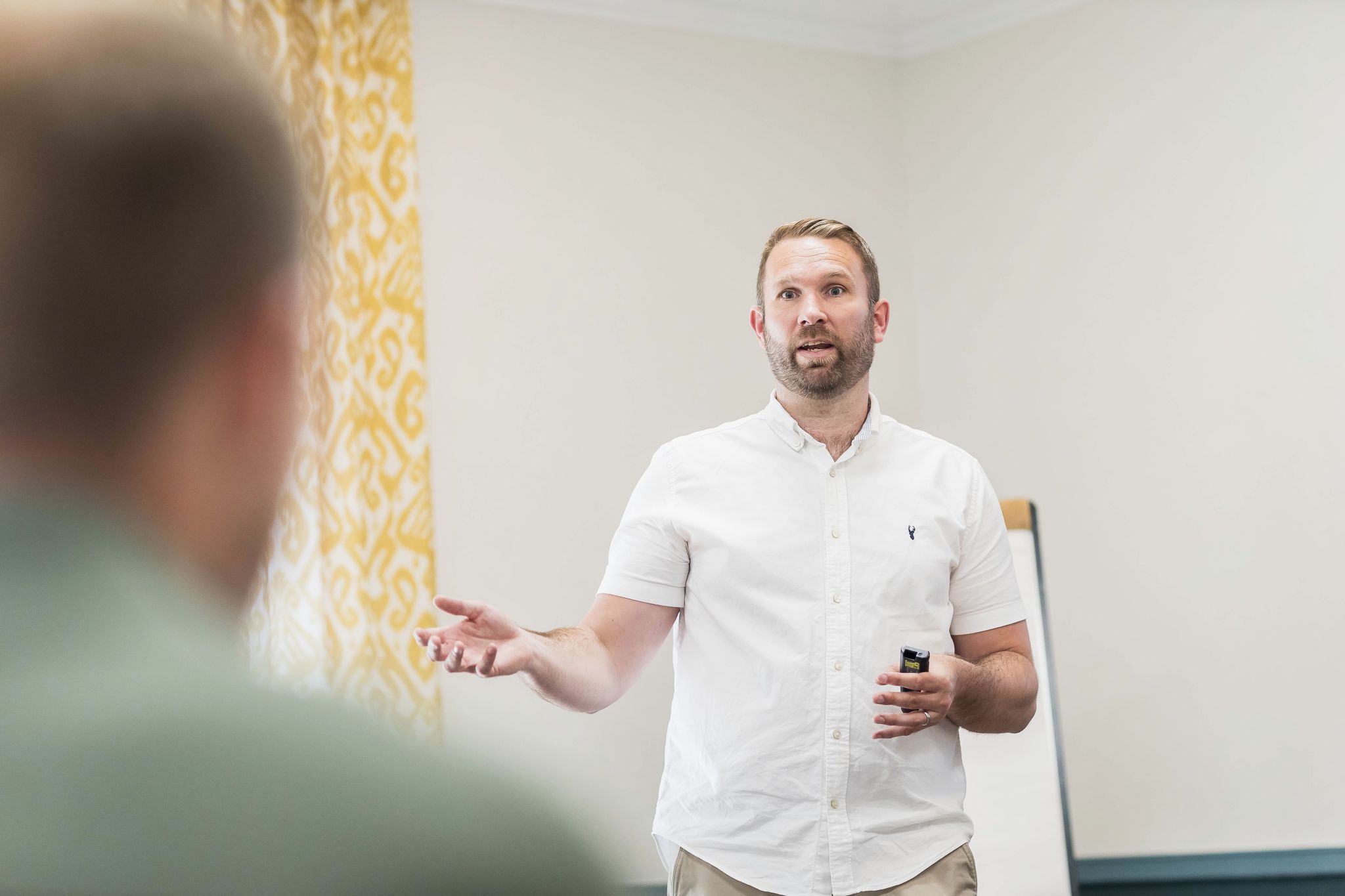
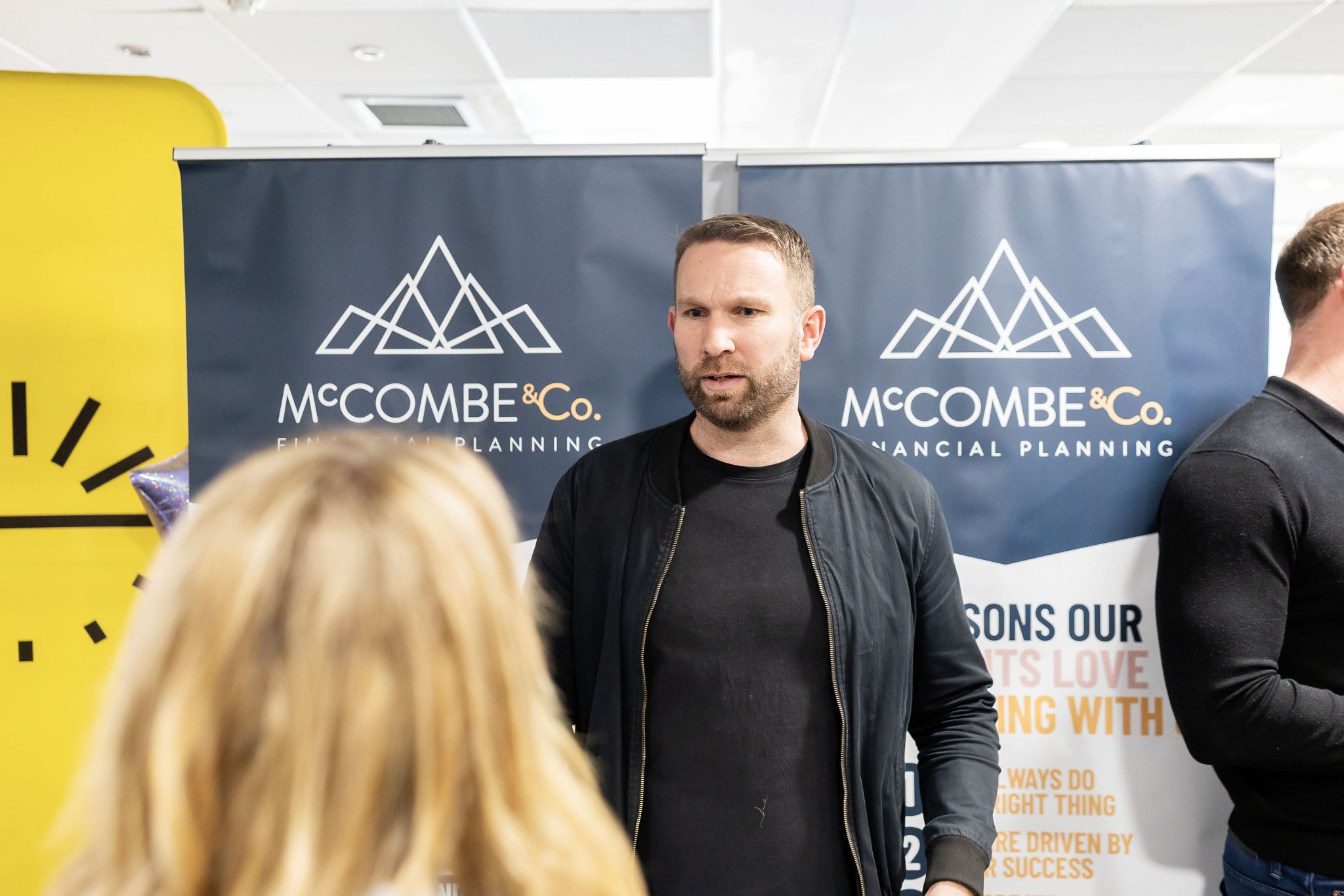
After 20 years as a professional footballer, John McCombe made a decision that many former athletes find daunting - he went out on his own. McCombe & Co Financial Planning was built on two decades of relationship-building, trust and personal experience of navigating the financial complexities that come with a career in sport. The business was John's = his name above the door, his reputation on the line, his values at the centre of everything. What he needed was a brand that reflected all of that. Not a generic financial services identity that could belong to anyone. Something that felt distinctly his — professional, modern and credible enough to open doors with families, business owners and professionals from day one. Esben Studio worked closely with John to develop the full brand identity for launch - creating a visual language built around a navy blue and gold palette that communicates both authority and approachability. Everything from the logo to the launch social assets, print materials, email signatures and LinkedIn starter pack was considered, consistent and ready to go from the moment the business opened.
Client
McCombe & Co Financial Planning
Year
2025
Services
Brand Identity, Logo Design, Social Assets, Print Design


A brief built together. A brand built to last.
Good brand work starts with a good brief. Before we designed a single thing, we sat down with John and worked through what McCombe & Co needed to communicate, who it was speaking to and what it needed to feel like. A former professional athlete starting a financial planning business has a genuinely compelling story - one that builds instant credibility and trust with clients who are navigating similar life stages and financial decisions. The brief that came out of those conversations was clear. Modern but not cold. Professional but not corporate. Confident enough to sit alongside established financial services firms, personal enough to reflect the individual behind the name. The navy blue and gold palette answered all of it. Navy brings the gravitas and professionalism the sector demands. Gold adds warmth, distinctiveness and a subtle nod to achievement that felt right for someone with John's background. Together they created an identity that felt immediately recognisable and completely ownable.


Ready to hit the ground running.
Launching a business is a significant moment. The last thing a founder needs is to be scrambling to pull together a coherent brand presence at the point when they most need to make a strong impression. We made sure John didn't have to. The full launch package we delivered - logo, social assets, print materials for banners, email signature and a LinkedIn starter pack - meant that when John went live, every touchpoint looked consistent, professional and considered. From the first LinkedIn post to the first in-person meeting, the brand was ready. For a business built on trust and long-term relationships, that first impression matters enormously. John launched with a brand that reflected the quality and care he brings to his clients - and gave him the confidence to go to market exactly as he'd intended.