Sculpt Activewear
A logo redesign for a brand that had already built its community - and was ready for an identity to match.

Sculpt Activewear had done something that most businesses spend years trying to achieve. They had found their customer, understood them deeply, and built a loyal community of hardcore brand supporters around a product they genuinely loved. The ICP was nailed. The marketing and social was working. The community was engaged. But the logo and brand aesthetic belonged to an earlier era of the business - one that predated the self-confidence and community that Sculpt had grown into. It was time for a new era. A logo that reflected who Sculpt actually was, who their customer was, and where the brand was going. Esben Studio was commissioned to lead the redesign, working closely with the founders, the marketing team and a brand specialist in a structured, consultative process that took the brand on a journey from rough ideas and early instincts through to a refined, considered identity built to last.
Client
Sculpt Activewear
Year
2025
Services
Brand Identity, Creative Direction, Logo Design

A process built around the people who know the brand best.
The best brand work doesn't happen in isolation. It happens through genuine collaboration between the designers who understand the craft and the people who understand the business, the customer and the culture the brand lives in. From the outset we brought together the Sculpt founders, their marketing team and a brand specialist to work through the brief properly. What does Sculpt stand for now? Who is the customer and what does she respond to? What does the current identity get right and what does it fail to communicate? What are the reference points - from the fashion world, the activewear market and beyond - that feel right for where the brand is going? Those conversations shaped everything that came after. Our design process then took the raw material of those sessions - the rough ideas, the references, the instincts scribbled on paper - and built them into structured creative directions. Multiple options, each with its own visual logic, presented with the context to understand what each was trying to achieve and why.

A logo that wears as well as it displays.
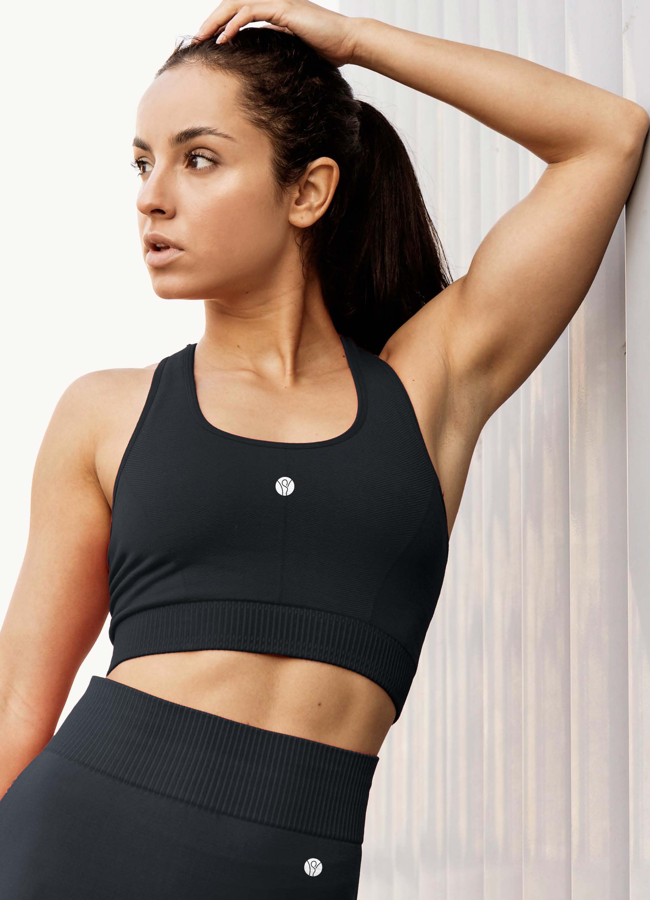
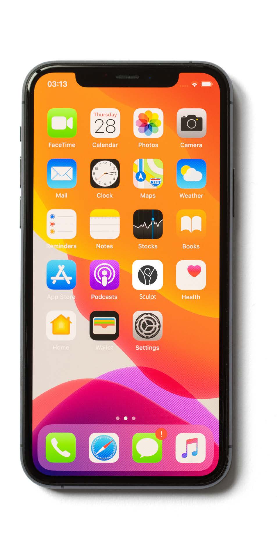
Sculpt's customer is a woman who is proud of her strength, her community and her style. The identity needed to reflect her. The subtle S nestled into the mark gave the logo a layer of personality and ownership that a purely typographic approach wouldn't have achieved. It is distinctive enough to be instantly recognisable as Sculpt's, simple enough to work at every scale and application, and refined enough to sit comfortably alongside the fashion and lifestyle brands that Sculpt's customer also wears and follows. The visual identity system we built around the logo gave Sculpt the consistency and confidence to carry the new era of the brand across every touchpoint - from the physical products that their community wears with pride to the digital presence that keeps growing it.